[DESIGN STAR RECAP] Episode 7: Come See The Softer Side of Courtland, Er, Sears
 Monday, August 2, 2010 at 07:41AM | by
  Erica
Erica COURTLAND IS NOT GAY??
WHAAAAAAT????
It's kind of difficult to focus on much else this week after that fucking bombshell. I mean, I pretty much feel exactly like I did during the Crying Game when we finally find out that that chick was a dude. Except that I don't believe him for one red hot second.
I mean, who the fuck am I? And what the fuck do I know? But if I had to bet my life savings on whether or not Courtland's "fiance" Dina's ass will be showing up on Oprah in a few years talking about how she "just missed all the signs!," I would bet yes 11 million billion times.
The only reason I *might* believe that he's telling the truth is that I find him completely, mind-blowingly annoying, and I pretty much love all gay people everywhere.
Speaking of gay ppl I love: HELLO GUEST JUDGE, JOHN GIDDING!
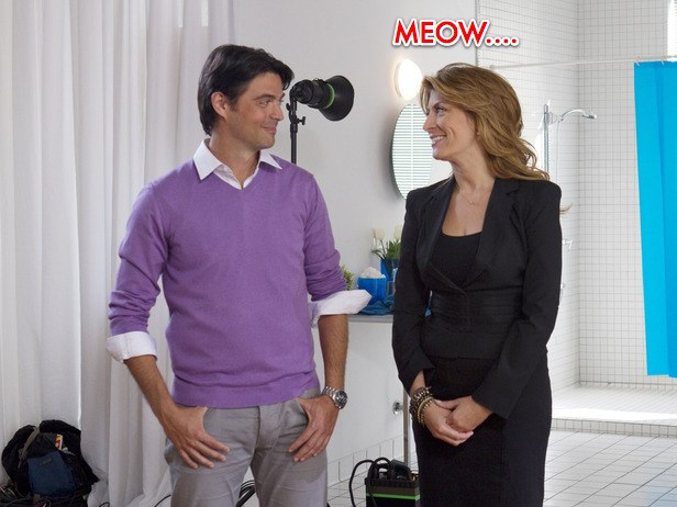
I just registered the url: PlsKeepJohnGiddingOnDesignStarForevs.com and I mean it...HARD. Needless to say, Candice was NOT missed. Even my eyeballs were all: "thank you for not making us look at Candice's disgusting outfits tonight...the scar tissue can finally heal from last week."
So, since Courtland was now on a team by himself after last week's double elimination, I'm sure you're all guessing that its now an individual competition and its every man for himself/herself for the final 5? BUT THAT WOULD MAKE WAY TOO MUCH FUCKING SENSE PPL! And the one thing we can credit Design Star with being consistent with is lame ass challenges week after week. Yet again, btchz do not disappoint.
So for this week's retarded challenge, both teams needed to choose a basket of themed items and then design a kitchen inspired by these items for a Sears catalog shoot. If they would have left it at that, I could have hung with this idea, but NOOOOO. On top of choosing this lame-o basket, each person needed to (everyone together now) "choose an individual item to provide your own inspiration among the team." You know...YOUR SIGNATURE.
Although I'm not actually *on* Design Star, I feel like I've already put in enough time and effort into this season to offer up my own signature element. And its so darn versatile, it could really work very well in any room for any design challenge. Ok, so here we go. Ready???:
"LICK IT UP BABY...LICK. IT. UP."
So as the winner from last week, Alex gets to choose first, and his team (him, Casey, Michael) choose the French basket.
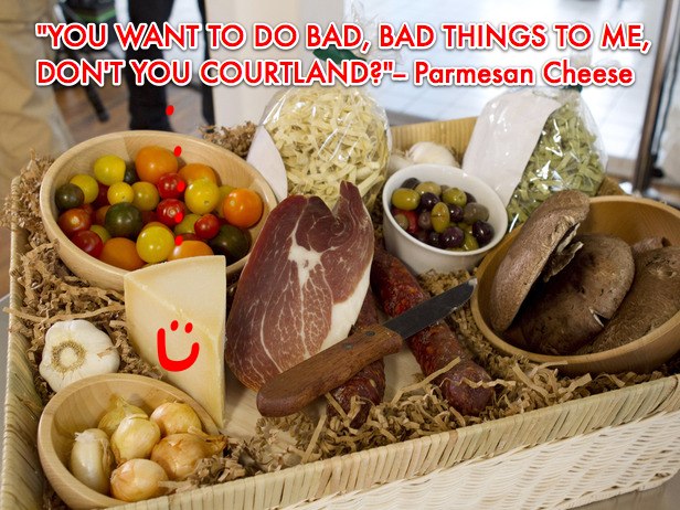
Courtland and Emily choose the Italian basket, and in the single development that ensured that this ep wasn't a complete fucking snoozefest, Courtland chose the Parmesan cheese.
In yet another not so subtle moment of foreshadowing, Gen asks Emily to announce her occupation in front of the entire group. GAHHHHH! She's a prop stylist! For catalog shoots! Wouldn't it be UTTERLY SHOCKING if she fucked this whole entire challenge up????
Waaaay.
Literally, not a single interesting thing happens during the design/staging process for both teams except that Michael was being a whiny little bitch about Alex the whole time. But really, can you blame him? I mean he "wanted to bring the layer of rusti-city a little deeper," which is something I think we've all struggled with at one time or another. And I know that that can be rully, rully stressful!
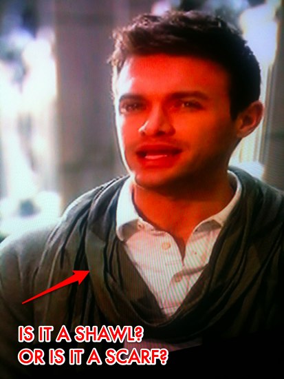
Can we also take a time out here to discuss Michael's scarf situation? He always seems to be wearing one, loosely draped around his neck and it srsly bugs the living shit out of me. First of all, enough with the fucking scarves. And second of all: if you ARE going to wear a scarf, wear it around you neck, bro...there's no need to drape it around your shoulders like a goddamned granny shawl.
So, Emily picks garlic; Casey chooses a baguette; Michael chooses escargot shells and Alex chooses a corkscrew. Michael thinks "this is a screwy choice" and thinks "it's going to screw him in the end." Yet again, thank you HGTV for telling us everything that will happen on the show in the first 11 seconds.
Emily gets worried that all their shit is the same color, so like any good New Yorker she orders a million dollars worth of food and wine from Fresh Direct. I'm not getting paid to say this, but I swear to gawd: there is nothing on the planet that I enjoy more than having to NEVER step foot in a supermarket again, thanks to my BFF's at Fresh Direct.
When its time to style their kitchen before the shoot, Emily unsurprisingly shoots her load allll over the counter by setting up approximately 1,457 vignettes, all of which have nothing to do with nothing AND only bring more attention to the fact that their kitchen looked allll sorts of shitty.
Of course she was right, but can we concentrate on all of the wonderful quotes that Courtland dropped on our faces regarding his parmesan cheese for a moment? Yes, let's:
- "My inspiration comes straight from Parmesan cheese."
- "Parmesan cheese, it just FEELS good."
- "Parmesan cheese walls...is there anything better?"
Personally, I can't think of a fucking thing better, Courtland. So no.
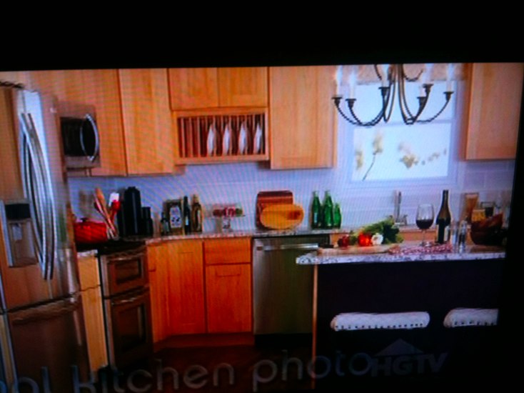
Back at Kitchen HQ, my ass was all sorts of bored with Courtland-n-Emily's rustic kitchen blech for the red team (shitty iPhone photos AH-gain, cause HGTV can't get their ass together fast enough). I HATED the purple painted island and I hated Courtland's parmesan walls (which I don't think really went with the backsplash tiles they chose). I hated the stainless appliances (can we all pls just be over stainless steel appliances already??) and I srsly hated that light fixture. For me, that kitchen screams midwest mediocrity and *looks* exactly like a catalog, rather than a real kitchen.
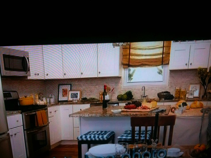
While I don't necessarily feel like it was screaming French, I did dig the blue team's kitchen waaaaay the hell more. Even though there were was also way too much shit on the counter, I do feel overall that their space is more homey. I also dig the counters with the backsplash that they chose (in terms of matching), and like the artwork they have propped up on the counter. Again: would I ever choose this as my kitchen: NO FUCKING WAY, but it was a lot more successful than the first and I think they should have won.
But NOOOOO, the judges decide to yet again change shit up at the end and instead of judging by team, they're going to judge individually. I cannot tell you how infuriating this is as a viewer. Basically it says to me: WE HAVE NO FUCKING CLUE WHAT WE'RE DOING AND JUST MAKE UP THIS SHIT AS WE GO ALONG. For some bizarro reason Casey wins, which whatever...I guess someone had to so it may as well be her.
Vern was pretty tame at judging, and it was so fucking nice to not have Candice around, distracting us all from everything being said with her gag-inducing outfits. Also, can we talk about the fact that Alex totally copied John's outfit from the beginning of the show? I mean, you can see John up above: purple sweater, khaki-ish pants, sleeves pushed up to his elbow.
And here's Alex:
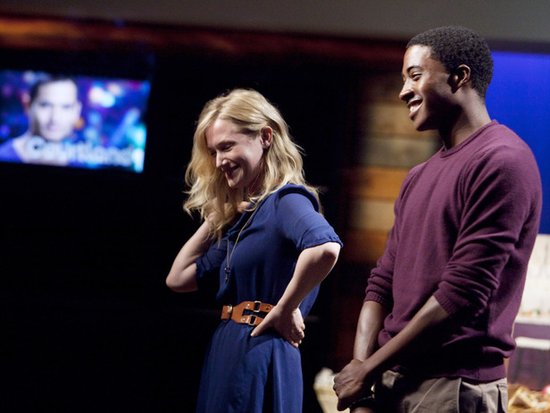
Uhm, there is no white shirt, BUT: purple sweater...CHECK. Khaki-ish pants....CHECK. Sleeves pushed up to his elbow....CHECK MATE. Looks like you've got a fashion stalker, Mr. Gidding!
So yeah: no one was buying Alex's claim that his corkscrew was all about functionality and that he brought bucket loads of functionality to his kitchen. So despite the fact that his presentation was much better than Emily's (which actually sucked surprisingly hard), his ass got the boot.
And then Michael danced through the streets naked...except for a loosely draped scarf around his shoulders. [PROBABLY].
Next Week:
Final 4, btchz. And I SWEAR TO FUCKING GAWD, IF THERE ARE NOT INDIVIDUAL CHALLENGES NEXT WEEK, MY ENTIRE RECAP IS GOING TO BE IN ALL CAPS. THAT'S RIGHT, PPL: THE WHOLE. FUCKING. THING.
 Design Star,
  design on tv |
  Post a Comment


Reader Comments