[DESIGN STAR RECAP] Episode 9: People in Glass Houses
 Sunday, August 15, 2010 at 08:42PM | by
  Erica
Erica 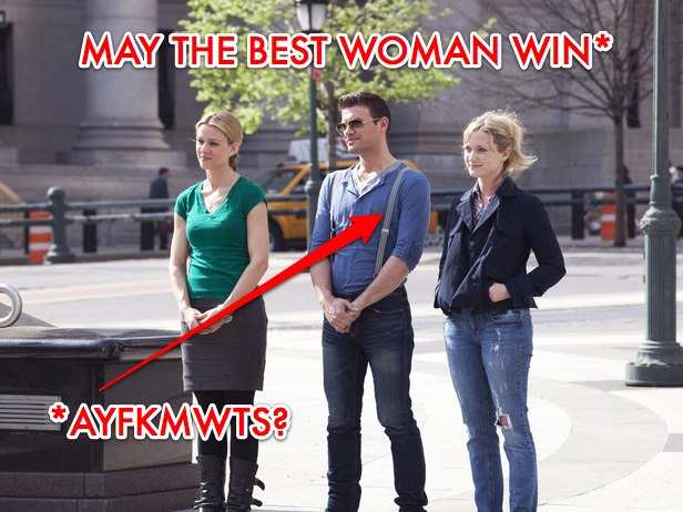
 FIN-A-FUCKIN-LY.
Yep folks, at long last it happened. We popped our individual challenge cherries last night, and is the case the first time most of us got laid: it wasn't as good as we thought it would be...but also it wasn't as bad as getting punched .
Most importantly WE DID IT TOGETHER PPL! I-N-D-I-V-I-D-U-A-L-L-Y! And isn't that what matters most??
Also, Michael got confused and thought it was still the firefighter ep, so he decided to dress like one.
So yes, two milliseconds before this entire fucking show is over, we got our individual challenges. Each of the remaining 3 designers, Casey, Emily and Michael were asked to design a glass box "sunroom."
Why the fuck they called these glass box things "sunrooms" I have no goddamned idea. The only thing I can think of is because they were sitting out in the sun which, yeah, makes zero sense. Cause no one decorated their rooms like a sunroom, or referenced sunroom-ish things, or used sunroom-y colors, but whatevs. If there is anyone left on planet Earth who's still trying to make actual sense of this show, they need to be eleminated from our society Darwinian style. Cause yeah: I'm pretty sure we've all given up.
 So before everyone gets decorating, the judges bring out last year's winner Antonio Bellatore...cause he knows what the final three are going through...and can sympathize better than anyone...and also he desperately needs people to watch his own show which is airing right after this bitch is done.
Whatevs...I love Antonio, so it was fine with me [sidenote: maybe Antonio & Nina can do an HGTV show and call it "Beauty and the Beast!" And, duh, Nina would be the beast! Genius, riiiii???].
So yeah, now Vern asks all the designers if they've given any thought to the sort of show they'd wanna have on HGTV if they won. To quote Michael directly: My show concept would be to help those starter outers, out of college run around town, do a little flea market shopping and put things together in a way that inspires them and creates an environment that will make them achieve their dreams."
WHAT IN THE MOTHERFUCK DOES THAT EVEN MEAN??? You will help people go shopping at flea markets in a way that ensures they will acheive all of their lifelong dreams? This shit is better than Courtland's instrument speech.
Casey wants to do a show that helps people redecorate with their own things and Emily wants to do a show helping people discover their design style through their fashion style. And all the designers then need to use their show inspiration for the rooms that they create.
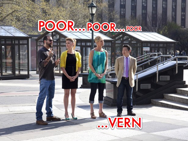 Also, HOW does Vern not have it written in his contract that he is never, ever, ever under any circumstances to stand next to Candice!? The dude looks so extra sadz standing next to her, he almost makes it hard for me to make fun of him (a-l-m-o-s-t).
Another breakthrough in this ep: I think I finally figured out what annoys the fuck out of me the most about Michael (aside, of course, from the whiny, bitchy, unjustifiably cocky thing): the dude *genuinely* thinks he's funny. Like, a real laugh riot. I swear he sits around at night in front of his vanity, brushing his hair 100 times and trying to come up with saucy quips he can casually, like he just thought of them, drop right on our fucking faces. He probably even has a laugh track that he plays in the background as he imagines us all laughing until our botox shots wear off. "People who design in glass houses shouldn't throw stones," cue gigantic fake smile. "I'm the last man standing," <<WINK, WINK>>, cue gigantic fake smile.
RECORD SCRATCH.
You are SOOOOOOOOOOOOOOOOOOOOOOOOOOOOOOOOOOOO not funny Michael. Also you desperately need to get over yourself...like in a srsly epic way.
Also, who knew I would be so fucking disturbed by Vern attempting to raise his voice and rally the group?? And yet I soooo was. Vern yelled at everyone to come out of their glass boxes sunrooms as he had a berry berry important announcement to make. THEY HAD HELP! THEIR FRIENDS AND FAMILY WERE STANDING BY! Yet again, I have to say: horrendous fucking production decision, HGTV. Bring back old contestants...preferably ones with mural and goose feather fetishes please. Not their boring, loving, not gonna fuck them over BFF's. Le sigh.
Anyway.
 Everyone bought a bunch of shit for their room and lumber liquidators installed each of their floors. I wish lumber liquiditators would come by my apartment, because lumber liquidators really seems like a top notch lumber organization. In fact, if there was ever a hardwood floor vendor that I thought best embodied the attitude and spirit of DIY, bootstrapped, design, its lumber liquidators (ok, while that was NOT a sponsored paragraph, IT COULD HAVE BEEN. So now its up to you to pay me a million billion dollars to sponsor a paragraph about [INSERT NAME OF YOUR BUSINESS HERE] next time around). Also, FYI HGTV: that's kind of what it sounds like when you ask the contestants to mention the name of a company 10 times at the end of random sentences (but I am still available to write a sponsored paragraphs about [INSERT NAME OF YOUR BUSINESS HERE]0. Inquire within.
So then we get this 45 second montage of Michael clumsily using a variety of power tools and all I kept thinking is: HE'S GONNA CUT OFF HIS HAND!!! THIS IS GONNA BE THE BEST DESIGN STAR EP EVER! But alas, he did not. So way to mix it up Design Star editors! Normally you blow your load in the first few mins of the show, but I appreciate you taking the time to keep us guessing tonight.
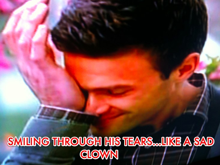
Then Michael cried....cause its SOOOOOOO HARD TO BE A DESIGN STAR, y'all. But take note, ppl: even in the MIDDLE OF CRYING, the dude managed to plaster his fake smile all across his face.
Antonio tells everyone to go big with their designs, so YAAAAY. We should finally get to see some epic designs after 8 weeks of crap sandwiches! And in fairness, shit *was* way the fuck better than it has been.
Casey's sunroom got judged first. Surprisingly (mostly because I hate Michael with the fire of a thousand hot burning suns) I liked her space the least:
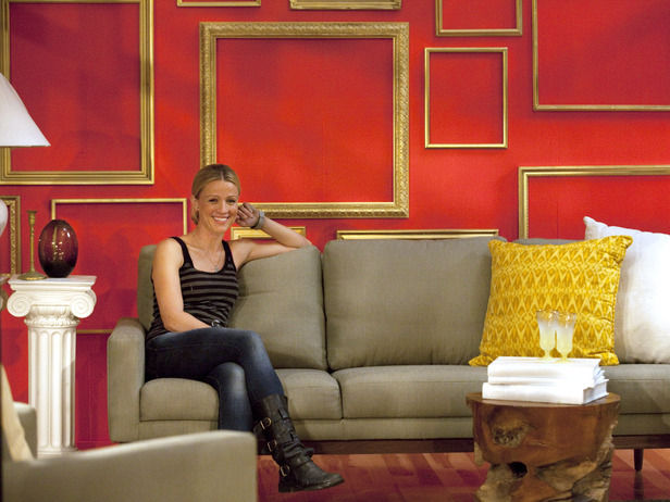
I did like that she spraypainted all of those vintage frames gold and hung them on a wall, and I guess her furniture choices were mostly ok, but also that space looks boring as hell...and in comparison to the other two, totally fucking empty. I mean, it looks like she got $1000 less than everyone else. And those columns on the side of the couch made me vom pretty damn hard. As Vern pointed out, she was the only one to do anything on the ceiling, so whatevs: bravo for that (she threw up some sheers). Unlike some of the other people who have come and gone, I do think Casey has some interesting ideas, and clearly she's not a total and complete design moron. But this space was meh to miggity maxx for me.
Next came Michael's space:
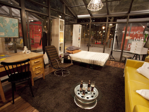
I actually liked Michael's space more than I thought I would (which was not at all). He seems to be going for a bit of an industrial chic look, piled on with a little mancave action. He made a table out of a hub cab, so that was semi-creative, and he also built a makeshift Murphy Bed in between some Ikea bookshelves (that was actually functional). But while he space def seems more alive than Casey's, it still needs a bit more oomph to it. And to top everything off, Michael put up these horrendously ugly wall decals all over the space. I hate wall decals more than I hate Hitler (and I'm a Jew), so needless to say, this was grounds for immediate elimination for me, no questions asked. As SOON as he started putting up those decals, I honestly would have been ok with one of the producers coming over and just saying "Dude...srsly? You're going there? You need to go home right the fuck now."
As far as I'm concerned, they saved the best for last. Here is Emily's space:
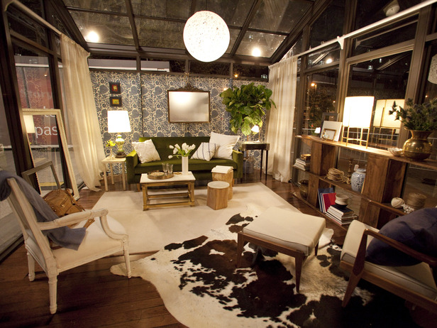
Aside from the slightly bizarro coffee table cluster, I actually like this quite a bit. This whole room was inspired by one of Emily's vintage dresses (blue of course...that seems to be her signature color). She hung some fabric along the back wall as a cheaper alternative to wall paper, mixed her furniture choices nicely, and styled the living the fuck out of this space...in a good way. Gen told her that she made the room "feel rich...and its hard to make a glass box feel rich." WORD. I loved the layered rugs, and that bookshelf! That was a bunch of stacked cement blocks on top of each other that she covered in wood...such a great simple idea. Anyway, her room was clearly the best.
Though again and again, the judgest have stressed that hosting is just as much a part of this all as design is.
Everyone did much better on their hosting this week, though I was nervous about the fact that Emily actually did the worst out of the bunch. She had lost her voice, and sounded like the little girl from the Exorcist once she's possesed by the demon, but stil, it's clearly just not her forte...Y-E-T.
Casey did pretty well, and Michael did fine except for the fact that he's so over the top fake you spend the whole time he's talking thinking of diff ways to punch him in the face.
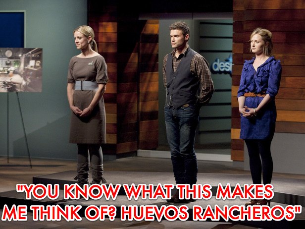
I really thought it was gonna be Casey and Emily...but nope. Case got the boot.
So the final two Design Stars are Michael and Ems.
I really think Emily is way too fun and quirky for HGTV...and Michael's kind of a perfect fit, but duh: I want Emily to win x a thousand million billion.
I'm not even bothering to discuss Candice's weekly outfits anymore, cause I feel like its almost akin to making fun of Britney Spears now...I mean what else is there to say?. Except for maybe this: she was wearing black pantyhose this week. Like not black tights, black pantyhose.
Anyhoo.
Next Week:
A winner is crowned! This show is over! And I can finally start live Tweeting Mad Men like a fucking normal person! Here's Dooce's recap; make sure to read Room Fu's recap interview with Casey today; Emily always does a killer recap on her blog; and duh: MFAMB's recap is not to be missed either.
 Design Star,
  TV |
TV |  Post a Comment


Reader Comments