


[REVIEW'D] Designer Visions @The Setai
 Erica
Erica 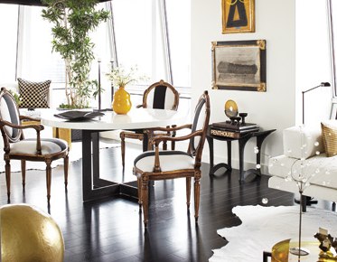
 The Setai LobbyBREAKING: Real estate in NYC is ridiculously fucking expensive.
So, there's now this "thing" where new luxury apt bldgs team up with famous Interior Designers to zhush up model apartments and help potential buyers realize what is possible in their spaces. The WSJ wrote about this phenom last week (Designers Enlisted in Sales Wars). Basically this goes down becuz:
A. Buyers have no vision...EVER.
B. There's a prestige factor.
C. More people are likely going to come traipsing through the building and hopefully/maybe buy more apts.
Hearst has cleverly taken this concept one step further with a yearly designer showcase called Designer Visions in which their 3 home mags (Veranda, House Beautiful and Town & Country), team up with 3 hot designers (this year its Steven Gambrel, Jim & Phoebe Howard, and Richard Hallberg), to deck out 3 apts at the hot new luxury NYC building du jour (this year its The Setai). They've been doing this for 4 years now, so maybe they invented this whole concept. I have no clue...but, honestly, it is pretty damn clever.
Last week, me-n-my bud Nicole from Sketch42 Blog went over for a private tour of this year's Designer Vision apts. The theme this year was Cinema Style, so each apt was inspired by a particular film, chosen by the designers themselves.
House Beautiful's "Something's Gotta Give" Apt


This one was layered and warm and a nice balance between the boy/girl aesthetic. While I'm way the hell into dude design myself, I think it takes an extremely keen eye to successfully mesh the male/female vibe in a way that doesn't make either want to barf. The space was also comfortable while still rocking a luxurious vibe. Like you *knew* these people were rich, but they're probably not snooty btchz. So while this apt was not really my taste at all, I thought it did a great job of incorporating lots of nods to the movie, without being TOO over the top about it.


The table was set for a dinner party and Diane Keaton's character Erica's filofax was sitting on a little table in the kitchen. The props were there, but also if you didn't see the movie, you'd still be able to appreciate the space.
The kitchen was probably my least favorite part of the apartment...I'm just not a hardcore wood girl, and it was a bit too much for me.


Ok fine, so maybe the Master Bedroom IS a bit on the girly side. And if its way too girly for me, I'm wondering how Jack Nicholson would like it? I wasn't totally crazy about the color palette in the Master Bath, but holy shit the views!


Jack Nicholson's character's Harry's study was probs my fave (I told you...I'm all about dude design). And Erica's "study" looked kinda like a bedroom, but allegedly she likes to do all her work on her laptop and wanted a space to zen out in.
Town & Country's "Six Degrees of Separation" Apt


Ok, so this apartment confused me...like a lot. I'm normally riding shotgun on the Steven Gambrel fan train, but this joint makes me want to burn my membership card and then sprinkle the ashes over that Vern Yip Urban Oasis apt floor just to make sure they are fully exorcised. I seriously wasn't feelin' this one. Like in a deep, down, dirty way.


I feel like this apt could have possibly belonged to Mrs. Roper if Mrs. Roper won the lottery and decided to hire a decorator. Like, I actually began to feel twitchy and uncomfortable just from being in this apartment. And the "living room"/kitchen are was ground zero for my bubbling haterade.


Left: photo via Sketch42 Blog
First of all, instead of a sofa, there were two gigantic dining room tables (see above). Now these tables themselves were super cool (covered in gorgeous Italian, richly colored papers), however, these were TWO GIGANTIC DINING ROOM TABLES THAT WERE IN THE LIVING ROOM INSTEAD OF COUCHES. I mean !!!!??? And not only were there two gigantic dining room tables instead of couches, these tables were placed next to each other crookedly, rather than head to head (in order to make one long table. Which still would have been infuriating, but it would have been WAY better).
On top of the table disaster, there were these heavy looking billowy curtains separating the kitchen and the "living room" and it was just SO MUCH...like completely gag-a-riffic. Now despite the fact that I wasn't even able to detect the teeny tiniest bit of haterade for this apt from our incredibly gracious Designer Visions host, if you'll take a quick little gander at the photo above on the right (which I swiped from their site), you can see that the curains are barely even visible. Hmm.....verrrrry interesting. Thankfully, Nicole from Sketch42 snapped a photo with the curtains in their full on glory....or gag-ery. The choice is yours.
The very top left photo does show a tiny little seating area set up off the far left of the living room, so there was a little something there, but I just thought this whole room made absolutely no sense.
The *one* thing I did like was the blue/green color, and some v. cool artwork.


The rest of the apartment, while still not my taste, was much less offensive. The study was fine--it seemed like a warm, functional room. Like I could genuinely buy that people would be working in there. Though its existence made me feel even MORE confused about the living room. Like if they had those two gigantic tables cause they needed some place to work in their apt and they didn't have any add'l space I could maybe, kinda sorta begin to see it. But with a study, it just left me feeling like, hunh??
The bedroom was nice...and in a strange way felt as big as the living room. There was still a bit too much going on for me texturally (even though I actually liked the fabric chosen to separate the bathroom/bedroom and thought the bedspread was killer).


Left: photo via Sketch42 Blog
But the best feature in the apt BY FAR, was the tub in the bathroom. It was S-I-C-K. The water comes down through a faucet in the ceiling...in the CEILING, PPL! The tub was also so big and deep, it felt like you could comfortably fit 4 ppl in there. Or, ok, maybe 2 (get your head out of the gutter). They didn't turn on the shower for us, but based on this photo, water shoots out from all the walls...which makes the fact that that there would barely be any room in there for my ass with all the plants *almost* *kinda* worth it.
Veranda's "Wall Street" Apt


Ok, this apt was sex on a stick. I loved practically every square inch of this place, and honestly could have moved right the fuck in without changing anything. This place was designed with Michael Douglas's character from Wall Street in mind, and so I guess my design style can also be described as "Wall Street chic."
I loved the black and white with pops of gold...I loved the cow hide...I loved the artwork--the whole thing just ruled my face.


photos above and below left via Sketch42 Blog
That money sign painting was *slightly* cheesy...and I totally didn't buy that that a dude would go to the trouble of putting together this whole achingly chic apartment and then plop this pillow on his bed...


A "money never sleeps" pillow? Come on...that's pure cheezball. Also, you can see very clearly in the above photo of the bedroom, this totally bizarro feature these apts all have: a gigantic "window" opening between the bedroom and the master bath. You *can* choose to shut it, but if you're the type of person who likes to watch your husband take a dump, you can also leave it open. Personally, I think this thing is totally whack...I mean, if you want to offer it as an option, great, but this thing comes STANDARD in these apts. Anyway, as crazy as it is, this was the only apt I could see this making sense in.


Also, AERON CHAIRS??? Those suckers looked hella odd in there...that dude would have had a big, important, "don't fuck with me" chair at his desk for himself, and a sleek, cool modern, way more uncomfortable chair on the other side for the poor shlep who had to sit there. But yeah, the artwork was insanity, and the faux leather wall covering in the study was almost lickable. Love, love, loved it.
To find out more about Designer Visions, or source any of the finishes/items in any of the above photos, click on over hurr.
*All photos above courtesy of Designer Visions, except where noted.
Post a Comment
Reader Comments